Shooting Film in Mackinaw City, Michigan (2002)
It wasn’t that long ago that I remember reading — almost daily — articles debating whether digital was “better” than film. I think with recent increases in megapixels and tonal range, digital has pulled ahead. At least when comparing 35mm transparencies to my current Nikon D810 images, it’s an obvious choice to me. “Better” remains a question. I know there are folks that just prefer that film “look” — and that’s fine — but as far as shadow detail and the lack of film grain, I think digital is now firmly in the lead in my book.
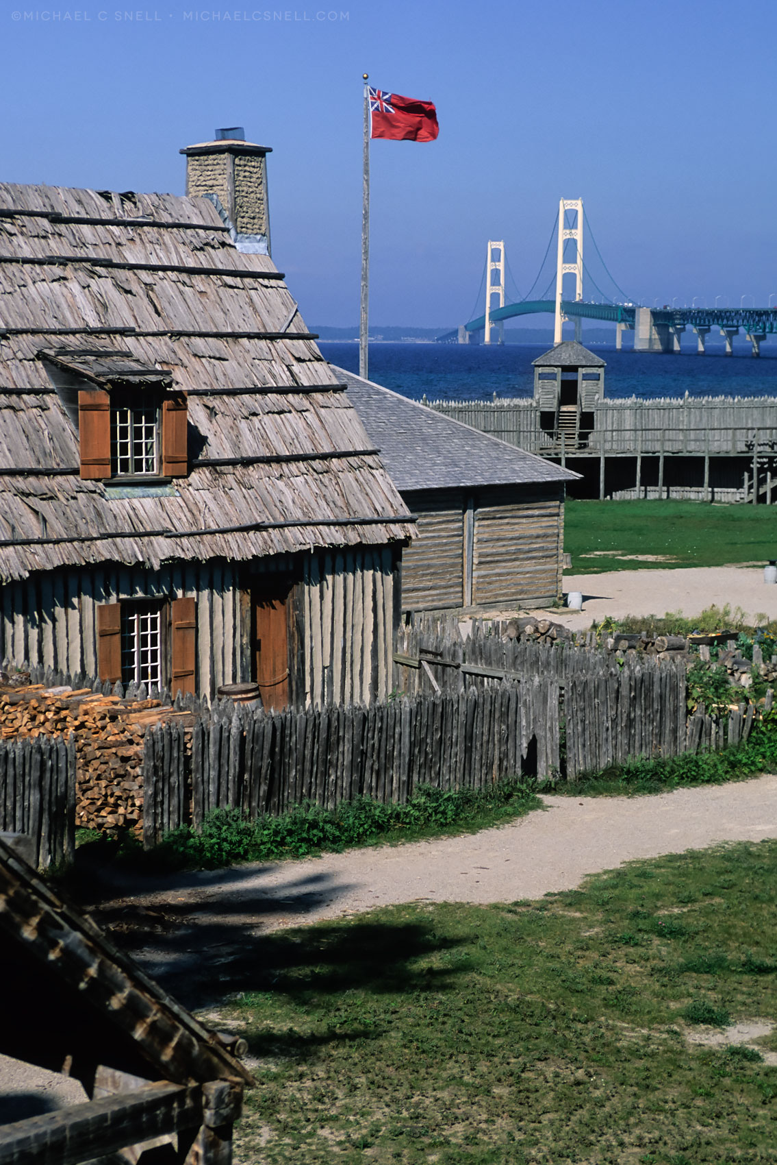
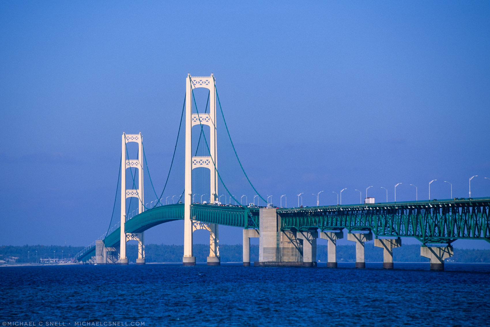
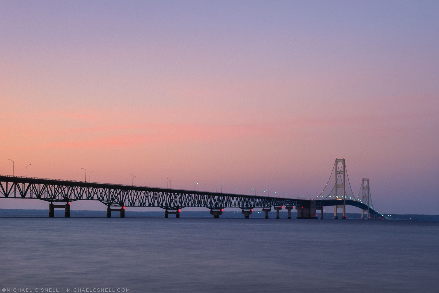
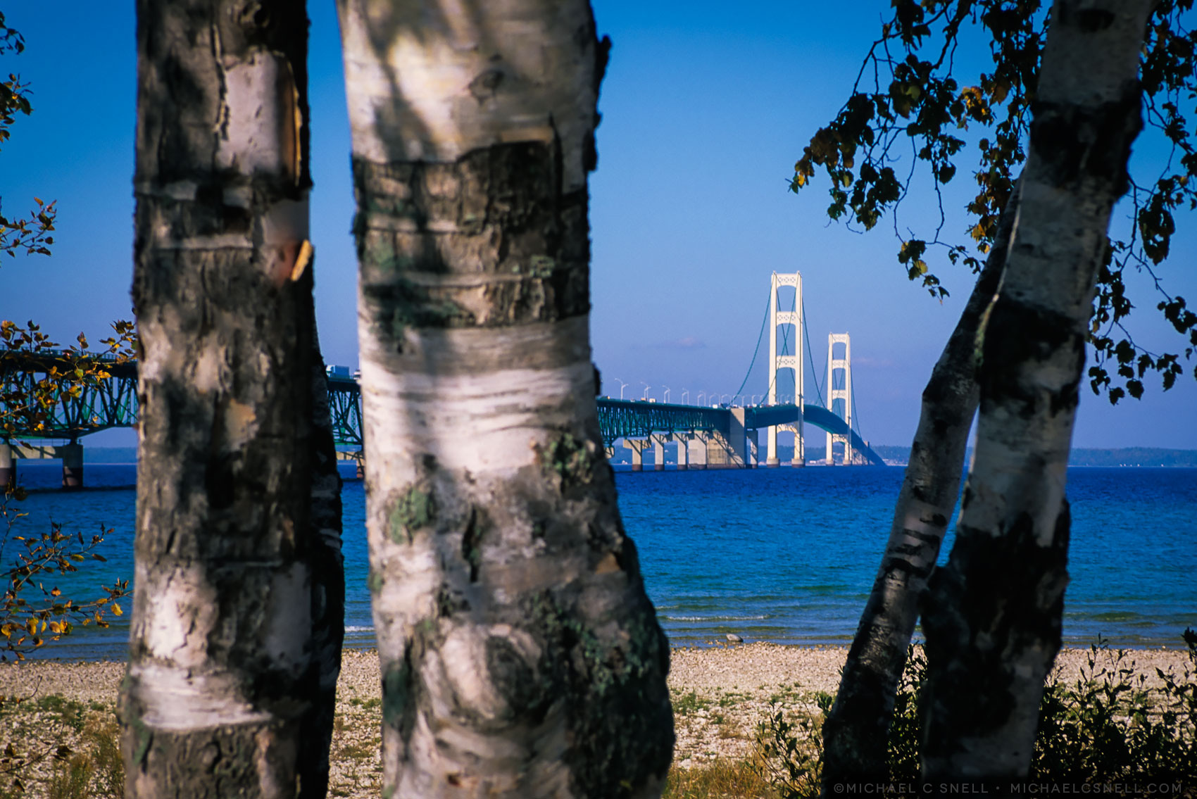
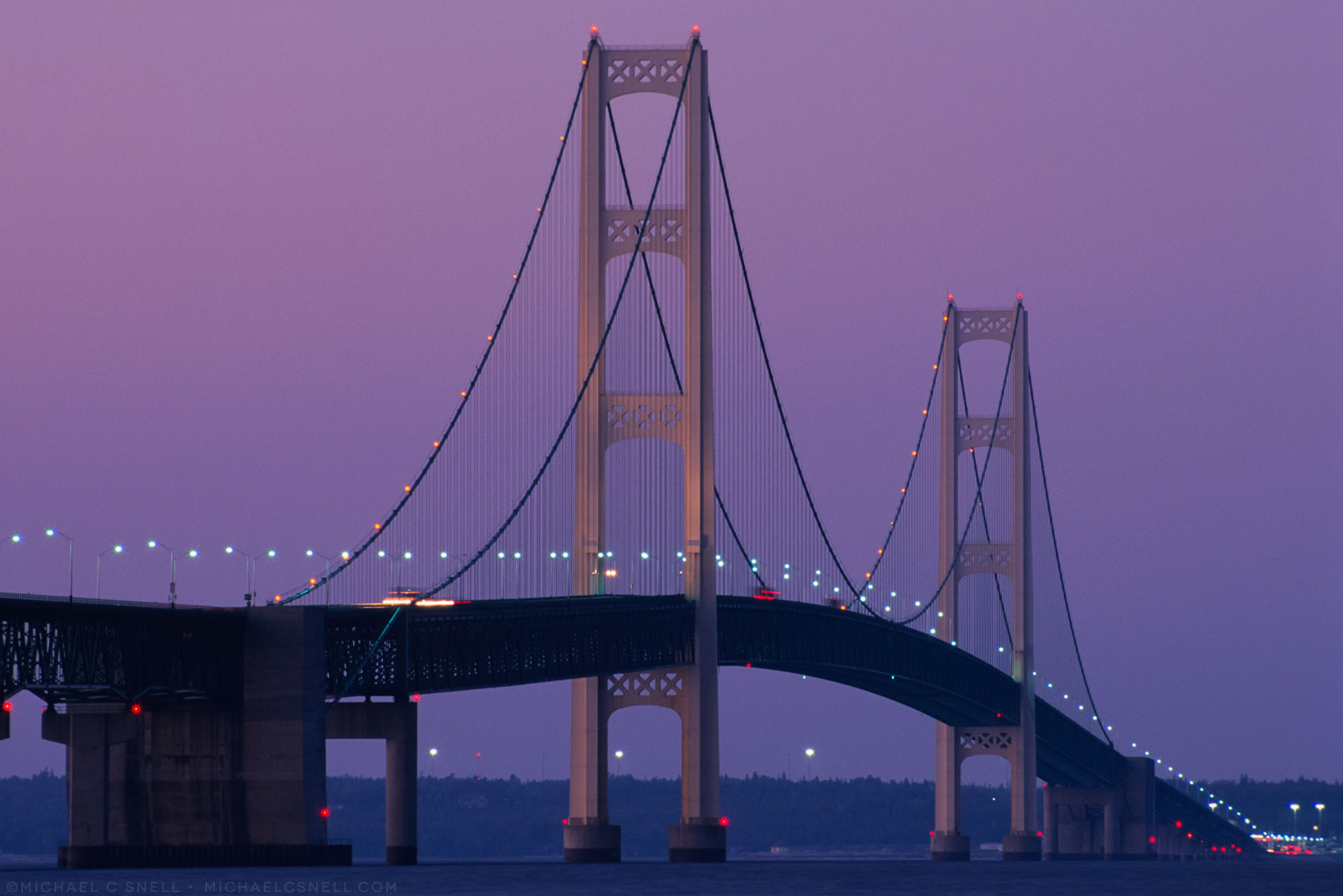
I was looking at these old slides I took of the Mackinac Bridge (also known as “the Mighty Mack”) in Michigan. I believe I shot them on my Nikon F100 and it was most likely Fuji Velvia film. They were later scanned on a Nikon Coolscan 5000 scanner, resulting in an image that is 5378 pixels wide. That’s larger than a file from my 16 megapixel camera (4,028 pixels wide) but considerably smaller than from my current 36 megapixel D810 (7,360 pixels wide).
I always shot the finest-grained film I could and with a high-end drum scanner, you couldn’t really see much grain. On my Coolscan, however, I’ve always picked up a little grain, or texture, from those slides. I think it has to do with the fact that the transparencies were suspended in oil on the drum scans. I believe that eliminated any texture that might be picked up from the emulsion’s surface. So the texture I’m seeing in my Coolscan scans is partly that — texture of the film surface rather than actual grain. Just guessing, though.
I also find that, when I look back at my old Velvia transparencies, the strong contrast and vivid colors feel overdone to me. With transparency, you got what you got. If you wanted saturated color, you shot Velvia and it had that distinct look. Now, with digital, there is no end to the manipulations you can do in post-processing so we become more subjective about what looks “right.”
But let’s be honest — we were manipulating the image all along. With film we were doing it by our film choices. Each varied from the reality of the scene in different ways (more contrast, brighter colors, deeper blues, etc.). Now, with digital, we are just making those decisions later in post-processing, and we have a wider range of options.
To my 2019 eye, Velvia no longer looks “right.” It’s too saturated and the shadows are too dense. If I processed a digital file to look the same way, I would feel that I had overdone it and gone too far. It’s funny how technology can change our concepts of what looks good, or “right.”
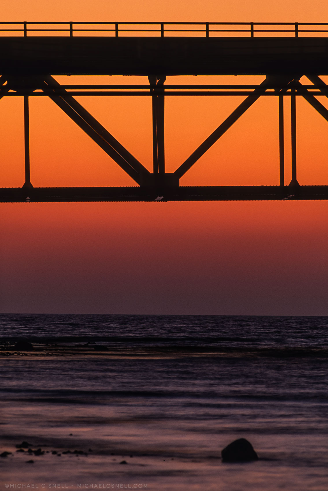
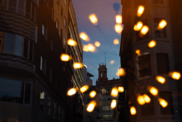
Back to the bridge — I shot these in 2002, on a road trip around the Great Lakes. I was very happy with the strong color at the time, but — again — they feel a little too blue and cold to me now. The night shots feel better, but I would probably pull those daytime blues back a bit if I were shooting these scenes digitally today (I probably should have used a warming filter at the time). Take a look at the gallery below and see what you think.