Fewer colors are often better.
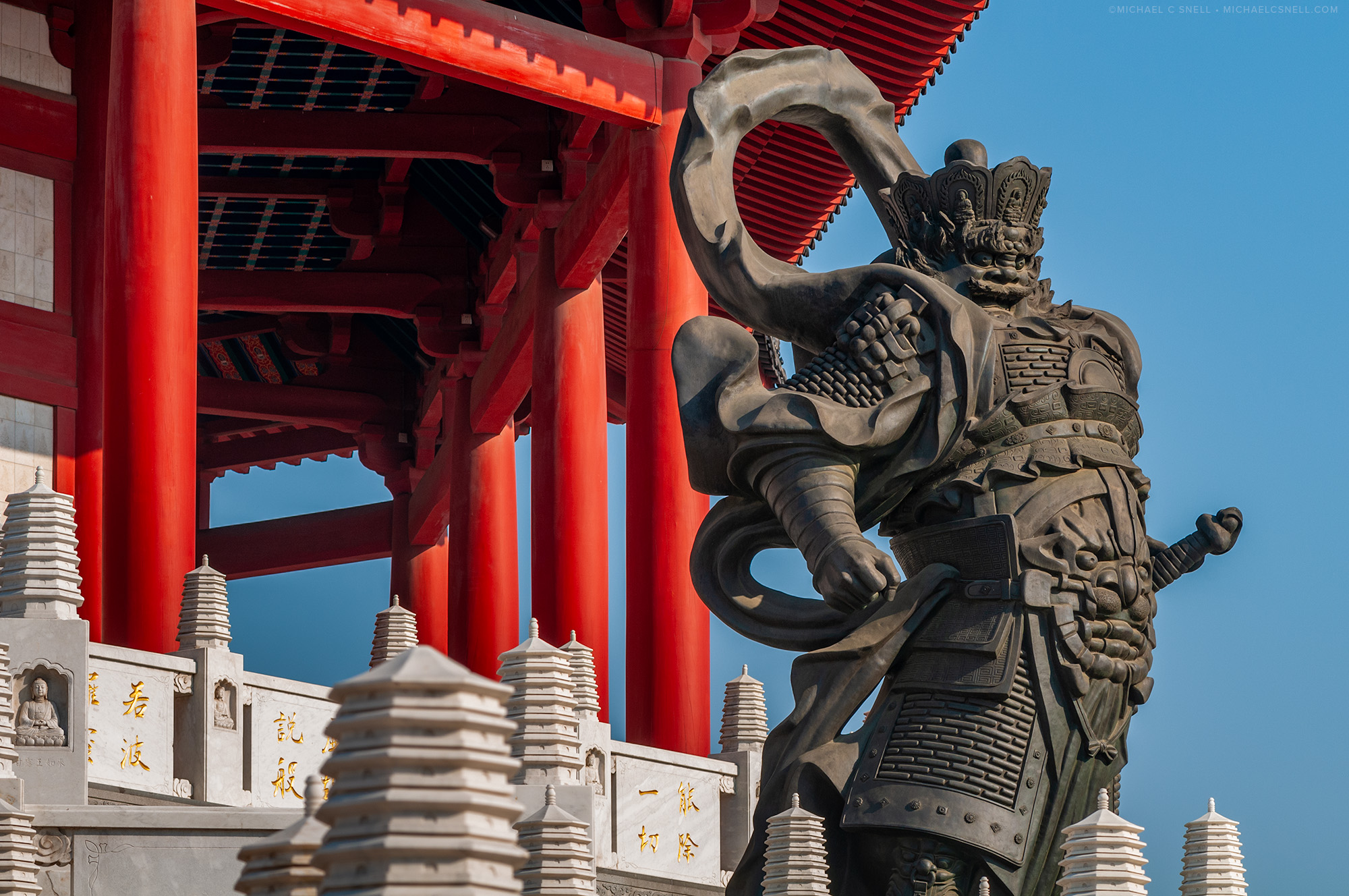
Sometimes color makes the image and sometimes it can be a distraction. While going through my files recently, I ran across this photo I shot at the Tianning Pagoda in Changzhou, China. It’s a very busy composition with lots going on, yet I feel it’s also a simple, graphic photo. throughout all of those architectural and sculptural elements and shapes, there are only two main colors, other than black and white: the red temple and the blue sky. Red, blue, white and black. A simple color palette for a complicated image.
Had I cropped wider, or moved to the side where a green treetop or another element had encroached in the frame, I think it would have started to fall apart. It’s not always possible to limit your color palette in this way, but it’s worth looking for these opportunities. I’ve also had images that had so much conflicting color in them that I felt they worked better in black and white. That’s another way to limit your palette — by removing color altogether. In the case of this photograph, though, the color actually helps separate and group the parts of the composition. I think that would be lost in a black and white version in this particular instance.