I’ve been giving Lightroom 3 (now 3.2) a real workout for the last few weeks. I’ve been importing my back catalog in massive chunks and making a quick pass at adjusting the original RAW files rather than importing the images that I had already tweaked previously in Adobe Camera Raw. This is a pretty big-stroke process right now — I’ll come back later and expand keywords and tweak the highly ranked shots — but it’s been a really interesting process to see the images improve. I’d like to think that the improvement is due to my own advancing skills in RAW processing, but the fact is that much of it is really due to improvements to the software over the years. Better processing algorithms and better controls.
I’ve been importing my 2006 images from Chile most recently and have noticed a couple of major advancements. One is Lightroom’s much improved ability to get rid of noise in high-ISO shots. Images that have never seen the light of day will now be going into my stock files because the noise that would never have passed Quality Control is now all but gone. Amazing. I’ll share some examples in the coming posts.
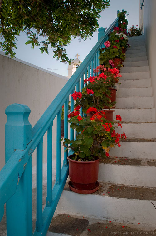
The most noticeable change in the images from Chile, though — especially Valparaiso — is how much more control I have over color now. Valparaiso is a city that is all about color. Colors you never thought you would see together, you’ll see in abundance in Valparaiso. Capturing some of these colors on film would have been frustrating. Sure, Velvia would have made that row of multi-colored row houses really pop. But then you’d round the corner to find a weathered, grey facade with the most subtle hues and you’d be cursing yourself for having 20 more exposures of that super-saturated film in your camera. One of my most favorite things about digital is just that — you can make decisions on a shot-by-shot basis and not be stuck with a film decision you made 10 exposures ago. Did you pop in a roll of ISO 800 film to shoot that dark church interior? Too bad now that you’re out in full sun and all kinds of contrast. No, being able to adjust ISOs and saturation levels for each individual image is a game-changer.

And that flexibility doesn’t stop with in-camera controls. Lightroom (as well as all other image processors, really) lets you tweak color and contrast in ways that film selection alone never even came close to. The Vibrance slider in the Presence panel has become one of my favorite tools. More subtle than the Saturation slider, it affects the blues and greens more than already-saturated reds and yellows. Very nice. And the sliders for adjusting the hue, brightness and saturation levels of individual colors take that control to another level.
One other set of controls that I find myself using more and more often is the new perspective correction panel — actually the “transform” controls in the lens correction panel. While I still prefer the “distort” controls in Photoshop, it is nice having some of this ability in Lightroom. The controls take some getting used to but they are a welcome addition.
I’ll go into more detail on each of these and other Lightroom features in future posts and show some examples.


 Here was the situation: This particular covered bridge was located right next to a newer, concrete bridge that replaced it. They were so close together that I couldn’t get the whole bridge in frame with my 17mm lens because there was no room to back up. This photo of the two bridges gives you some idea of the setting.